Plotting for Exploratory data analysis (EDA)
Contents
4.1. Plotting for Exploratory data analysis (EDA)#
4.1.1. Basic Terminology#
What is Exploratory Data Analysis?
Exploratory Data Analysis (EDA) is an approach to analyzing data sets to summarize their main characteristics, often with visual methods. A statistical model can be used or not, but primarily EDA is for seeing what the data can tell us beyond the formal modeling or hypothesis testing task.
What is DataSet?
Dataset is a collection of data. It is usually shown in a tabular format, with rows and columns. Each row represents a single piece of data, and each column represents a particular attribute of the data. For example, a dataset of people might have a column for a person’s name, a column for their age, and a column for their height.
What is Data-point?
A data point is a single value in a data set.
What is Feature?
A feature is an individual measurable property or characteristic of a phenomenon being observed. Features are the inputs to our model and we use them to predict labels.
What is Label?
A label is the output we want to predict. Given the features of a particular example, the model will try to predict the label. For example, in the Iris dataset, the species of the flower is the label.
What is Vector?
A vector is an ordered list of numbers. In machine learning, we typically use vectors to represent data points. For example, the vector [5, 2, 4] represents a 3-dimensional data point, and could represent a piece of fruit with a mass of 5 grams, a width of 2 grams, and a height of 4 grams.
What is Observations?
An observation is a data point. For example, a person’s height could be one observation from the Iris dataset.
What is Input Variable?
An input variable is a variable (x) whose value is observed or measured. For example, the length and width of the petals in the Iris dataset are input variables.
What is Output Variable?
An output variable is a variable (y) whose value is to be predicted. For example, the species of flower is an output variable in the Iris dataset.
What is Class Label?
A class label is a label for a class. For example, in the Iris dataset, the class label for the species Iris setosa is 0, the class label for the species Iris versicolor is 1, and the class label for the species Iris virginica is 2.
What is 1-D Vector?
A 1-D vector is a vector with a single number. For example, the vector [5] is a 1-D vector.
What is 2-D Vector?
A 2-D vector is a vector with two numbers. For example, the vector [5, 2] is a 2-D vector.
What is 3-D Vector?
A 3-D vector is a vector with three numbers. For example, the vector [5, 2, 4] is a 3-D vector.
What is Scalar? A scalar is a sin gle number. For example, 5 is a scalar.
What is Independent Variable?
An independent variable is a variable whose variation does not depend on that of another. For example, the length and width of the petals in the Iris dataset are independent variables.
4.1.2. Iris Flower dataset#
Toy Dataset: Iris Dataset: [https://en.wikipedia.org/wiki/Iris_flower_data_set]
A simple dataset to learn the basics.
3 flowers of Iris species. [see images on wikipedia link above]
1936 by Ronald Fisher.
Petal and Sepal: http://terpconnect.umd.edu/~petersd/666/html/iris_with_labels.jpg
Objective: Classify a new flower as belonging to one of the 3 classes given the 4 features.
Importance of domain knowledge.
Why use petal and sepal dimensions as features?
Why do we not use ‘color’ as a feature?
What is the Iris Dataset?
The Iris flower data set or Fisher’s Iris data set is a multivariate data set introduced by the British statistician and biologist Ronald Fisher in his 1936 paper The use of multiple measurements in taxonomic problems as an example of linear discriminant analysis. It is sometimes called Anderson’s Iris data set because Edgar Anderson collected the data to quantify the morphologic variation of Iris flowers of three related species. The data set consists of 50 samples from each of three species of Iris (Iris setosa, Iris virginica and Iris versicolor). Four features were measured from each sample: the length and the width of the sepals and petals, in centimetres. Based on the combination of these four features, Fisher developed a linear discriminant model to distinguish the species from each other.
!wget https: // raw.githubusercontent.com/uiuc-cse/data-fa14/gh-pages/data/iris.csv
'wget' is not recognized as an internal or external command,
operable program or batch file.
import pandas as pd
import seaborn as sns
import matplotlib.pyplot as plt
import numpy as np
import warnings
warnings.filterwarnings('ignore')


'''downlaod iris.csv from https://raw.githubusercontent.com/uiuc-cse/data-fa14/gh-pages/data/iris.csv'''
# Load Iris.csv into a pandas dataFrame.
iris = pd.read_csv("iris.csv")
# (Q) how many data-points and features?
print(iris.shape)
(150, 5)
# (Q) What are the column names in our dataset?
print(iris.columns)
Index(['sepal_length', 'sepal_width', 'petal_length', 'petal_width',
       'species'],
      dtype='object')
# (Q) How many data points for each class are present?
# (or) How many flowers for each species are present?

iris["species"].value_counts()
# balanced-dataset vs imbalanced datasets
# Iris is a balanced dataset as the number of data points for every class is 50.
setosa        50
versicolor    50
virginica     50
Name: species, dtype: int64
4.1.3. 2-D Scatter Plot#
2-D scatter plot is used to plot data points on a horizontal and vertical axis in the attempt to show how much one variable is affected by another.
# 2-D scatter plot:
# Defination:
# 2-D scatter plot is used to plot data points on a horizontal and vertical axis in the attempt to show how much one variable is affected by another.
# ALWAYS understand the axis: labels and scale.

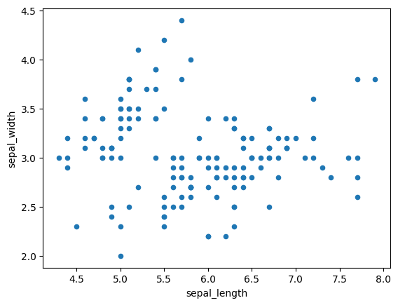
iris.plot(kind='scatter', x='sepal_length', y='sepal_width')
plt.show()

# cannot make much sense out it.
# What if we color the points by thier class-label/flower-type.
# 2-D Scatter plot with color-coding for each flower type/class.
# Here 'sns' corresponds to seaborn.
sns.set_style("whitegrid")
sns.FacetGrid(iris, hue="species", height=4) \
   .map(plt.scatter, "sepal_length", "sepal_width") \
   .add_legend()
plt.show()

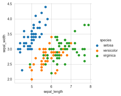
# Notice that the blue points can be easily seperated
# from red and green by drawing a line.
# But red and green data points cannot be easily seperated.
# Can we draw multiple 2-D scatter plots for each combination of features?
# How many cobinations exist? 4C2 = 6.
Observation(s):
Using sepal_length and sepal_width features, we can distinguish Setosa flowers from others.
Seperating Versicolor from Viginica is much harder as they have considerable overlap.
4.1.4. 3D Scatter plot#
https://plot.ly/pandas/3d-scatter-plots/
Needs a lot to mouse interaction to interpret data.
What about 4-D, 5-D or n-D scatter plot?
4.1.5. Pair-plot#
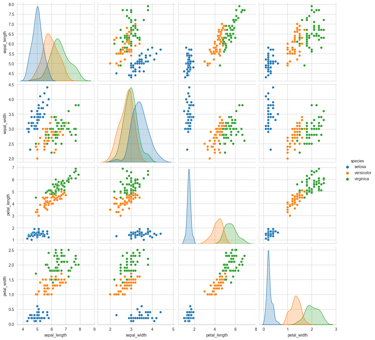
pairwise scatter plot: Pair-Plot Defination: Pair-Plot is also known as pairwise scatter plott, also known as scatter plot in 2-D, it displays all the possible 2-D scatter plots between the features, and the diagonal elements are PDFs for each feature.
Advantages:
Can be used to see which features are useful towards classification.
Can be used when number of features are high.

Dis-advantages:
Cannot visualize higher dimensional patterns in 3-D and 4-D.
Only possible to view 2D patterns.
# pair-plot on iris dataset

plt.close()
sns.set_style("whitegrid")
sns.pairplot(iris, hue="species", height=3)
plt.show()
# NOTE: the diagnol elements are PDFs for each feature. PDFs are expalined below.
Observations
petal_length and petal_width are the most useful features to identify various flower types.
While Setosa can be easily identified (linearly seperable), Virnica and Versicolor have some overlap (almost linearly seperable).
We can find “lines” and “if-else” conditions to build a simple model to classify the flower types.
4.1.6. Histogram, PDF, CDF#
What is Histogram, PDF, CDF?
Histogram: A histogram is an approximate representation of the distribution of numerical data.
PDF: Probability Density Function is the probability that the variable takes a value between two points.
CDF: Cumulative Distribution Function is the probability that the variable takes a value less than or equal to x.
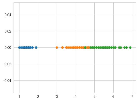
# What about 1-D scatter plot using just one feature?
# 1-D scatter plot of petal-length
import numpy as np
iris_setosa = iris.loc[iris["species"] == "setosa"]
iris_virginica = iris.loc[iris["species"] == "virginica"]
iris_versicolor = iris.loc[iris["species"] == "versicolor"]
# print(iris_setosa["petal_length"])
plt.plot(iris_setosa["petal_length"], np.zeros_like(
    iris_setosa['petal_length']), 'o')
plt.plot(iris_versicolor["petal_length"], np.zeros_like(
    iris_versicolor['petal_length']), 'o')
plt.plot(iris_virginica["petal_length"], np.zeros_like(
    iris_virginica['petal_length']), 'o')

plt.show()
Disadvantages of 1-D scatter plot:
Very hard to make sense as points are overlapping a lot.
Are there better ways of visualizing 1-D scatter plots?
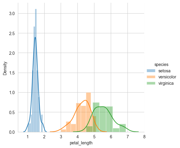
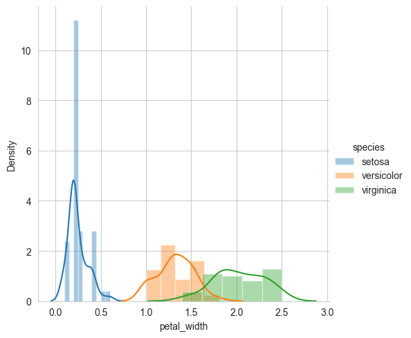
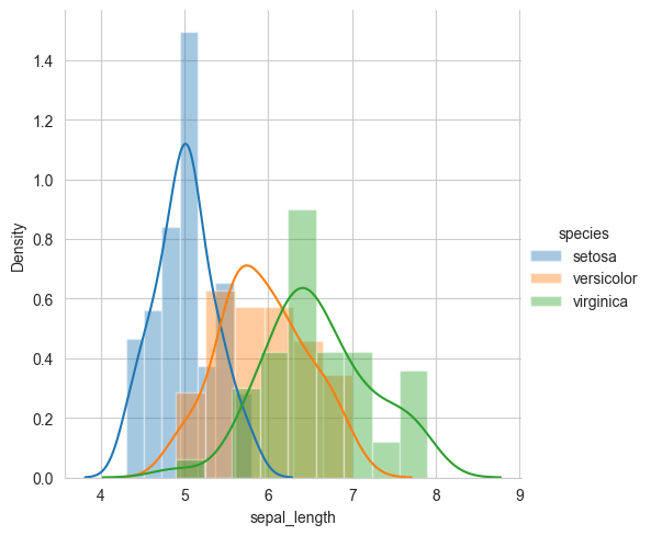
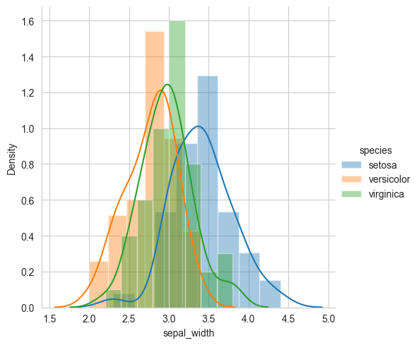
4.1.7. Univariate analysis using PDF.#
Defination: plotting of one feature at a time to understand the feature better and to get some insights about the feature and the dataset in general.
# Univariate analysis using PDF

sns.FacetGrid(iris, hue="species", height=5) \
   .map(sns.distplot, "petal_length") \
   .add_legend()
plt.show()
sns.FacetGrid(iris, hue="species", height=5) \
   .map(sns.distplot, "petal_width") \
   .add_legend()
plt.show()
sns.FacetGrid(iris, hue="species", height=5) \
   .map(sns.distplot, "sepal_length") \
   .add_legend()
plt.show()
sns.FacetGrid(iris, hue="species", height=5) \
   .map(sns.distplot, "sepal_width") \
   .add_legend()
plt.show()
# Histograms and Probability Density Functions (PDF) using KDE
# How to compute PDFs using counts/frequencies of data points in each window.
# How window width effects the PDF plot.


# Interpreting a PDF:
# why is it called a density plot?
# Why is it called a probability plot?
# for each value of petal_length, what does the value on y-axis mean?
# Notice that we can write a simple if..else condition as if(petal_length) < 2.5 then flower type is setosa.
# Using just one feature, we can build a simple "model" suing if..else... statements.

# Disadv of PDF: Can we say what percentage of versicolor points have a petal_length of less than 5?

# Do some of these plots look like a bell-curve you studied in under-grad?
# Gaussian/Normal distribution.
# What is "normal" about normal distribution?
# e.g: Hieghts of male students in a class.
# One of the most frequent distributions in nature.
4.1.8. CDF(Cumulative distribution function)#
CDF is the probability that the variable takes a value less than or equal to x.
# Cumulative Distribution Function (CDF)
# Need for Cumulative Distribution Function (CDF)
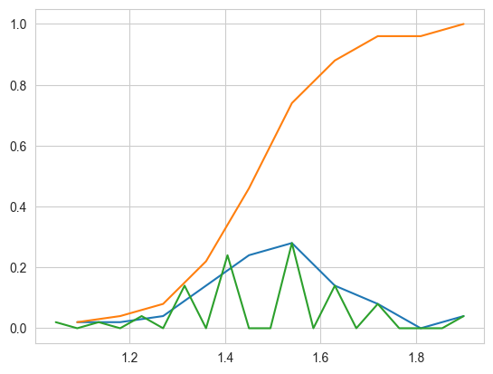
# We can visually see what percentage of versicolor flowers have a
# petal_length of less than 5?
# How to construct a CDF?
# How to read a CDF?

# Plot CDF of petal_length

counts, bin_edges = np.histogram(
    iris_setosa['petal_length'], bins=10, density=True)

pdf = counts/(sum(counts))
print(pdf)
print(bin_edges)

# compute CDF
cdf = np.cumsum(pdf)
plt.plot(bin_edges[1:], pdf)
plt.plot(bin_edges[1:], cdf)


counts, bin_edges = np.histogram(iris_setosa['petal_length'], bins=20,
                                 density=True)
pdf = counts/(sum(counts))
plt.plot(bin_edges[1:], pdf)

plt.show()
[0.02 0.02 0.04 0.14 0.24 0.28 0.14 0.08 0.   0.04]
[1.   1.09 1.18 1.27 1.36 1.45 1.54 1.63 1.72 1.81 1.9 ]
# Need for Cumulative Distribution Function (CDF)
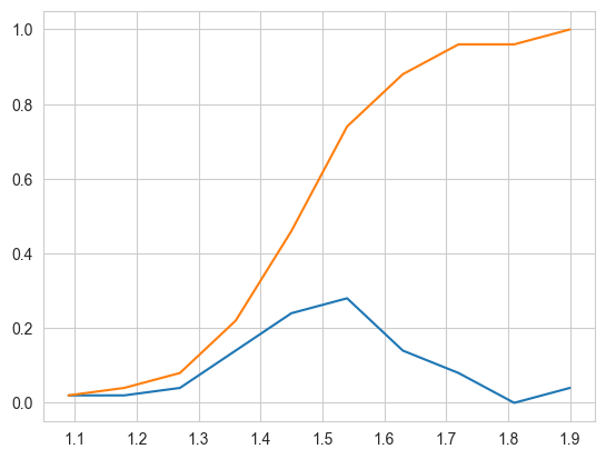
# We can visually see what percentage of versicolor flowers have a
# petal_length of less than 1.6?
# How to construct a CDF?
# How to read a CDF?

# Plot CDF of petal_length

counts, bin_edges = np.histogram(iris_setosa['petal_length'], bins=10,
                                 density=True)
pdf = counts/(sum(counts))
print(pdf)
print(bin_edges)

# compute CDF
cdf = np.cumsum(pdf)
plt.plot(bin_edges[1:], pdf)
plt.plot(bin_edges[1:], cdf)


plt.show()
[0.02 0.02 0.04 0.14 0.24 0.28 0.14 0.08 0.   0.04]
[1.   1.09 1.18 1.27 1.36 1.45 1.54 1.63 1.72 1.81 1.9 ]
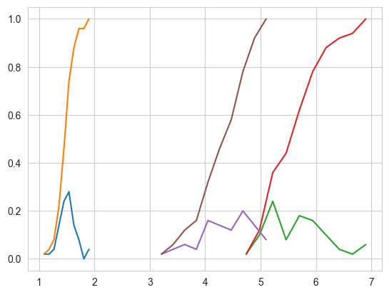
# Plots of CDF of petal_length for various types of flowers.

# Misclassification error if you use petal_length only.

counts, bin_edges = np.histogram(iris_setosa['petal_length'], bins=10,
                                 density=True)
pdf = counts/(sum(counts))
print(pdf)
print(bin_edges)
cdf = np.cumsum(pdf)
plt.plot(bin_edges[1:], pdf)
plt.plot(bin_edges[1:], cdf)


# virginica
counts, bin_edges = np.histogram(iris_virginica['petal_length'], bins=10,
                                 density=True)
pdf = counts/(sum(counts))
print(pdf)
print(bin_edges)
cdf = np.cumsum(pdf)
plt.plot(bin_edges[1:], pdf)
plt.plot(bin_edges[1:], cdf)


# versicolor
counts, bin_edges = np.histogram(iris_versicolor['petal_length'], bins=10,
                                 density=True)
pdf = counts/(sum(counts))
print(pdf)
print(bin_edges)
cdf = np.cumsum(pdf)
plt.plot(bin_edges[1:], pdf)
plt.plot(bin_edges[1:], cdf)


plt.show()
[0.02 0.02 0.04 0.14 0.24 0.28 0.14 0.08 0.   0.04]
[1.   1.09 1.18 1.27 1.36 1.45 1.54 1.63 1.72 1.81 1.9 ]
[0.02 0.1  0.24 0.08 0.18 0.16 0.1  0.04 0.02 0.06]
[4.5  4.74 4.98 5.22 5.46 5.7  5.94 6.18 6.42 6.66 6.9 ]
[0.02 0.04 0.06 0.04 0.16 0.14 0.12 0.2  0.14 0.08]
[3.   3.21 3.42 3.63 3.84 4.05 4.26 4.47 4.68 4.89 5.1 ]
4.1.9. Mean, Variance and Std-dev#
Defination of Mean: Mean is the average of all the data points.
Mean = (sum of all data points)/(total number of data points)
Defination of Variance: Variance is the average squared distance of data points from mean.
Variance = (sum of (xi - mean)^2)/total number of data points
Defination of Std-deviation: Std-deviation is the square root of variance.
Std-deviation = sqrt(variance)
#Mean, Variance, Std-deviation,
print("Means:")
print(np.mean(iris_setosa["petal_length"]))
# Mean with an outlier.
print(np.mean(np.append(iris_setosa["petal_length"], 50)))
print(np.mean(iris_versicolor["petal_length"]))
print(np.mean(iris_virginica["petal_length"]))

# Variance
print("\nVariances:")
print(np.var(iris_setosa["petal_length"]))
print(np.var(iris_versicolor["petal_length"]))
print(np.var(iris_virginica["petal_length"]))

print("\nStd-dev:")
print(np.std(iris_setosa["petal_length"]))
print(np.std(iris_versicolor["petal_length"]))
print(np.std(iris_virginica["petal_length"]))
Means:
1.464
2.4156862745098038
4.26
5.5520000000000005

Variances:
0.029504000000000002
0.21640000000000004
0.29849600000000004

Std-dev:
0.17176728442867112
0.4651881339845203
0.546347874526844
4.1.10. Median#
Defination: The middle value in the sorted data.
If the number of data points is odd, then the middle value is the median.
If the number of data points is even, then the median is the average of the two middle values.
Formulas for median with odd and even number of data points.
Median = (n+1)/2 th data point if n is odd.
Median = (n/2 th data point + (n/2 + 1)th data point)/2 if n is even.
Example 1:
1, 2, 3, 4, 5, 6, 7, 8, 9, 10
Median = ((10/2)+(10/2+1))/2 = (5+6)/2 = 5.5

Example 2:
1, 2, 3, 4, 5, 6, 7, 8, 9
Median = (9+1)/2 = 5 th data point = 5
Median with outlier
Example 1:
1, 1.01, 1.2, 1.24, 1.5, 1.6, 1.7, 1.8, 56
Median = (9+1)/2 = 5 th data point = 1.5
print("\nMedians:")
print(np.median(iris_setosa["petal_length"]))
# Median with an outlier
print(np.median(np.append(iris_setosa["petal_length"], 50)))
print(np.median(iris_versicolor["petal_length"]))
print(np.median(iris_virginica["petal_length"]))
Medians:
1.5
1.5
4.35
5.55
4.1.11. Percentile, Quartiles & Quantile#
Percentiles are given as percent values, values such as 95%, 40%, or 27%. Quantiles are given as decimal values, values such as 0.95, 0.4, and 0.27.
The 0.95 quantile point is exactly the same as the 95th percentile point.
H = [1, 2, 3,..., 99, 100]
Percentile
10th percentile = 10th value in H = 10
It means 10% of the values are below 10 and 90% of the values are above 10.
90th percentile = 90th value in H = 90
It means 90% of the values are below 90 and 10% of the values are above 90.

Quartiles
Q1 = 25th percentile = 25th value in H = 25
It means 25% of the values are below 25 and 75% of the values are above 25.
Q2 = 50th percentile = 50th value in H = 50
It means 50% of the values are below 50 and 50% of the values are above 50.
Q3 = 75th percentile = 75th value in H = 75
It means 75% of the values are below 75 and 25% of the values are above 75.

Quntiles
0.1th Quntile = 10th percentile = 10th value in H = 10
0.2th Quntile = 20th percentile = 20th value in H = 20
0.92th Quntile = 92th percentile = 92th value in H = 92
print("\nQuartiles:")
print(np.percentile(iris_setosa["petal_length"], np.arange(0, 100, 25)))
print(np.percentile(iris_versicolor["petal_length"], np.arange(0, 100, 25)))
print(np.percentile(iris_virginica["petal_length"], np.arange(0, 100, 25)))

print("\n90th Percentiles:")
print(np.percentile(iris_setosa["petal_length"], 90))
print(np.percentile(iris_versicolor["petal_length"], 90))
print(np.percentile(iris_virginica["petal_length"], 90))
Quartiles:
[1.    1.4   1.5   1.575]
[3.   4.   4.35 4.6 ]
[4.5   5.1   5.55  5.875]

90th Percentiles:
1.7
4.8
6.31
4.1.12. Median Absolute Deviation & IQR (Inter Quartile Range)#
Median Absolute Deviation: The median absolute deviation(MAD) is a robust measure of how spread out a set of data is from its median. It is a measure of variability similar to the standard deviation or variance, but is much more.
IQR (Inter Quartile Range): Inter Quartile Range (IQR) is the difference between the 75th and 25th percentile.
from statsmodels import robust

print("\nMedian Absolute Deviation")
print(robust.mad(iris_setosa["petal_length"]))
print(robust.mad(iris_versicolor["petal_length"]))
print(robust.mad(iris_virginica["petal_length"]))
Median Absolute Deviation
0.14826022185056031
0.5189107764769602
0.6671709983275211
4.1.13. Box plot and Whiskers#
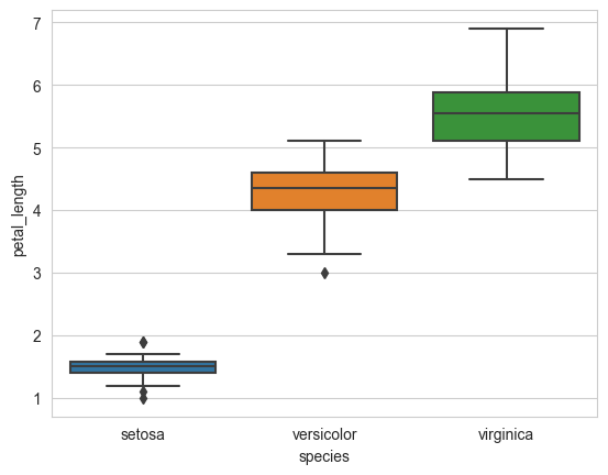
Box-plot is a way of statistically representing the distribution of the data through five main dimensions.
Minimum
First Quartile (Q1)
Median (Q2)
Third Quartile (Q3)
Maximum
Box-plot is a very useful tool for visualizing the distribution of data.
It is also very useful for identifying outliers in the data.
Box-plot is also very useful for comparing the distributions of two or more data sets.
Whiskers: Whiskers are the lines that extend from the box to the minimum and maximum values.
Whiskers are used to identify outliers in the data.
Outliers are the data points that are distant from the other data points.
Outliers can be due to measurement or due to data entry errors.
Outliers can also be due to the presence of rare events.
Outliers can be due to the presence of noise in the data.
Outliers can be due to the presence of errors in the data.
Box-plot with whiskers: another method of visualizing the 1-D scatter plot more intuitivey.
The Concept of median, percentile, quantile.
How to draw the box in the box-plot?
How to draw whiskers: [no standard way] Could use min and max or use other complex statistical techniques.
IQR like idea.
NOTE: IN the plot below, a technique call inter-quartile range is used in plotting the whiskers.
Whiskers in the plot below donot correposnd to the min and max values.
Box-plot can be visualized as a PDF on the side-ways.
sns.boxplot(x='species', y='petal_length', data=iris)
plt.show()
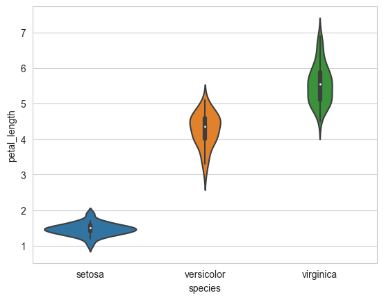
4.1.14. Violin plots#
Violin plot is a combination of box plot and histogram.
It is used to see the distribution of data and its probability density.
A violin plot combines the benefits of the previous two plots and simplifies them.
Denser regions of the data are fatter, and sparser ones thinner in a violin plot
sns.violinplot(x="species", y="petal_length", data=iris, size=8)
plt.show()
4.1.15. Summarizing plots in English#
Exaplain your findings/conclusions in plain english.
Explain any useful relationships you found.
Summarize the plots helps your colleagues understand your findings.
Writing observations helps Business people understand your findings.
Never forget your objective (the probelm you are solving) .
Perform all of your EDA aligned with your objectives.
4.1.16. Univariate, bivariate and multivariate analysis.#
Univariate analysis: Analyzing one feature at a time.
Exapmle: Histograms, PDFs, CDFs, Boxplots, Violinplots, etc.
Bivariate analysis: Analyzing two features at a time.
Example: Scatterplots, Pair-plots, etc.
Multivariate analysis: Analyzing more than two features at a time.
Example: 3-D scatter plots, Heatmaps, etc.
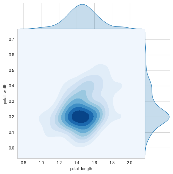
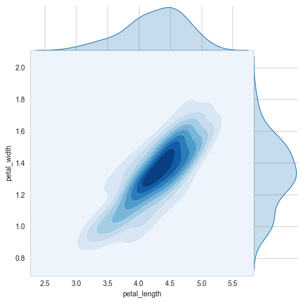
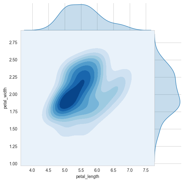
4.1.17. Multivariate probability density, contour plot.#
A contour plot is a graphical technique for representing a 3D surface by plotting constant z slices, called contours, on a 2D format.
It is a very useful tool for visualizing multivariate functions.
# 2D Density plot, contors-plot
sns.jointplot(x="petal_length", y="petal_width", data=iris_setosa, kind="kde", space=0, fill=True, thresh=0, cmap='Blues')
plt.show()
# 2D Density plot, contors-plot
sns.jointplot(x="petal_length", y="petal_width", data=iris_versicolor, kind="kde", space=0, fill=True, thresh=0, cmap='Blues')
plt.show()
# 2D Density plot, contors-plot
sns.jointplot(x="petal_length", y="petal_width", data=iris_virginica, kind="kde", space=0, fill=True, thresh=0, cmap='Blues')
plt.show()
4.1.18. Exercise:#
Download Haberman Cancer Survival dataset from Kaggle. You may have to create a Kaggle account to donwload data. (https://www.kaggle.com/gilsousa/habermans-survival-data-set)
Perform a similar alanlaysis as above on this dataset with the following sections:
High level statistics of the dataset: number of points, numer of features, number of classes, data-points per class.
Explain our objective.
Perform Univaraite analysis(PDF, CDF, Boxplot, Voilin plots) to understand which features are useful towards classification.
Perform Bi-variate analysis (scatter plots, pair-plots) to see if combinations of features are useful in classfication.
Write your observations in english as crisply and unambigously as possible. Always quantify your results.
iris_virginica_SW = iris_virginica.iloc[:, 1]
iris_versicolor_SW = iris_versicolor.iloc[:, 1]
from scipy import stats
stats.ks_2samp(iris_virginica_SW, iris_versicolor_SW)
KstestResult(statistic=0.26, pvalue=0.06779471096995852)
x = stats.norm.rvs(loc=0.2, size=10)
stats.kstest(x, 'norm')
KstestResult(statistic=0.2742848606810081, pvalue=0.37029174966086453)
x = stats.norm.rvs(loc=0.2, size=100)
stats.kstest(x, 'norm')
KstestResult(statistic=0.1843021776229944, pvalue=0.0019089693238741878)
x = stats.norm.rvs(loc=0.2, size=1000)
stats.kstest(x, 'norm')
KstestResult(statistic=0.0752864862134498, pvalue=2.243174820192964e-05)


